
")
What primary colors make orange? It's one of the most common paint questions out there, and honestly, it confused me too when I first started mixing colors.
In this blog, I'll walk you through everything. The right colors, the right ratios, the most common mistakes, and how to fix them.
I'll also cover shades, paint types, and pro tips that actually save time.
By the end, you'll know exactly how to mix bright, clean orange every time without any guesswork.
I've mixed paints across acrylics, oils, and watercolors for years. What I'm sharing here is what genuinely works.
What Primary Colors Make Orange in Paint?
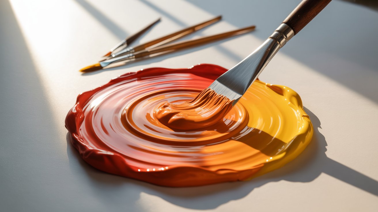
Red and yellow are the two primary colors that make orange.
That's the foundation of it. Mix a warm red with a warm yellow, and you get orange. The exact shade depends on your ratio.
More yellow gives you a lighter, brighter orange. More red gives you a deeper, richer tone.
One thing worth knowing early: use warm versions of both colors. Cool reds and cool yellows carry other pigments that muddy the mix. More on that in a bit.
Understanding Primary Colors in Paint (Why Red and Yellow Work)

In traditional paint mixing, the three primary colors are red, yellow, and blue. You cannot make them by mixing other colors. But you can use them to create almost everything else.
Orange sits between red and yellow on the color wheel. That placement is exactly why those two colors combine so cleanly into orange.
Blue stays out of this mix for a reason. Even a small amount of blue introduces green into the equation, which quickly turns your orange muddy. Keep your palette clean and your mix simple.
Step-by-Step: How to Mix Orange Paint Perfectly
Here's a clear breakdown of what you need and how to do it right.
Materials Needed
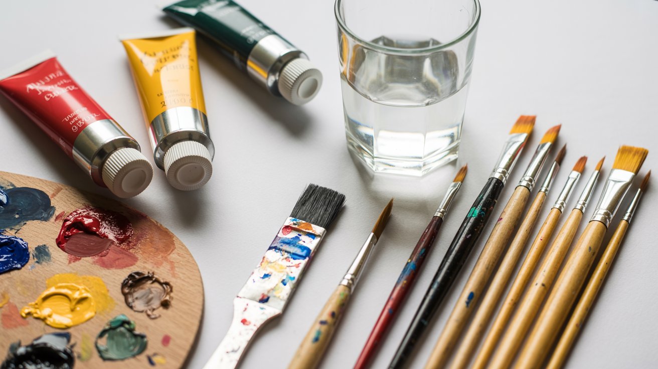
- Warm red paint (cadmium red is a solid choice)
- Warm yellow paint (cadmium yellow works well)
- A clean palette or mixing surface
- A palette knife or clean brush
- Water or medium based on your paint type
Steps
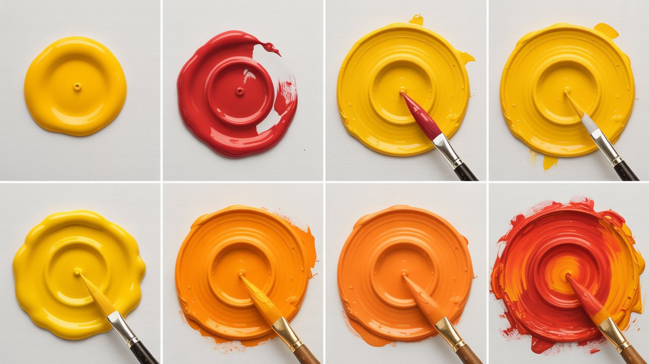
Let’s quickly get into steps:
- Start with a clean palette. Old residue changes colors quietly.
- Place yellow on the palette first.
- Add red slowly into the yellow, not the other way around.
- Mix in circular strokes using a palette knife.
- Adjust and test before committing to a full batch.
Recommended ratios:
A 50/50 mix gives you a classic, balanced orange. For a brighter result, try 60% yellow and 40% red. For a richer, deeper tone, flip it to 60% red and 40% yellow.
Beginner tip:
Always add the darker color to the lighter one. Starting with yellow gives you far more control over the final shade.
How to Make Different Shades of Orange
Once you have the base, there's a lot of range to work with.
Add white to lighten it. Even a small amount shifts orange toward peach or soft coral. Add brown or burnt sienna to deepen it without killing the warmth.
Avoid black here. It tends to flatten the color quickly.
Shades you can mix from orange:
- Peach:orange plus white
- Burnt orange: orange with extra red and a touch of brown
- Golden orange:orange shifted toward yellow
- Coral: orange with white and a hint of pink
- Earthy orange: orange with a tiny drop of purple
Each shade has its own personality. Testing in small amounts first saves a lot of wasted paint.
Common Mistakes When Mixing Orange (And How to Fix Them)
I've made all of these. Here's what usually goes wrong.
Adding red first. When you add yellow into a heavy red base, you lose control fast. Always start with yellow.
Using a cool red. Crimson and alizarin carry blue pigment. Blue plus yellow creates green, and green ruins your orange. Swap to cadmium red or any warm red.
Over-mixing. Once the colors are combined, stop. Extra mixing dulls the tone and strips out the brightness.
Dirty tools. Leftover paint on your knife or brush shifts the color without warning. Wipe everything clean before you start.
What Colors Can You Add to Orange to Change It?
Orange is flexible. Here's how to steer it in different directions.
White makes it lighter. Brown deepens it. A very small touch of blue cools the tone but use it sparingly or it turns brown fast.
Yellow brightens the mix. Red intensifies it. Black darkens but can dull the result, so go slow.
One mix I keep coming back to is orange with a tiny bit of purple. It creates a muted, earthy tone that works well for autumn scenes and warm skin tones.
Best Red and Yellow Paint Combinations for Bright Orange
The paints you choose matter more than most beginners expect.
For clean, bright orange:
- Cadmium Red plus Cadmium Yellow:warm, vivid, reliable.
- Vermillion plus Hansa Yellow:another strong pairing with clear results.
What to avoid:
Alizarin Crimson leans cool and will muddy your mix. Lemon Yellow runs cool too and pulls the result toward green-orange rather than a warm tone.
Stick to warm versions of both and your orange will stay clean.
Do the Same Primary Colors Make Orange in Watercolor?
Yes. The same rule applies. Red and yellow make orange across all paint types.
What changes is how you control the shade.
In watercolors, you add water to lighten. More water means more paper showing through, which softens the orange naturally. Less water keeps it saturated and bold.
In acrylics, the color dries slightly darker than it looks wet. Always test on a scrap piece first.
In oils, blending is smoother and the drying time is longer. This gives you more room to adjust while the paint is still workable. Orange in oils tends to read richer once dry.
The base rule stays constant. Your technique shifts based on the medium.
Why Your Orange Looks Different (Color Theory Explained Simply)
You followed the steps and it still looks off. Here's what's happening.
Every brand uses slightly different pigment formulas. Cadmium Red from one company may lean warmer or cooler than another. Same name, different result.
Lighting changes how orange reads. Under warm indoor light it looks rich. In natural daylight it reads differently. Neither is wrong. It's just how light behaves.
The surface also plays a role. Orange on white paper looks more vivid than orange on a toned canvas. The background shifts your perception of the color.
Knowing this helps you stop second-guessing your mix and start trusting your eye instead.
Practical Uses of Orange in Painting and Design
Orange shows up in a lot more places than you'd expect.
In painting, it handles sunsets, autumn leaves, citrus, warm skin tones, and desert landscapes. Getting the shade right makes these subjects feel real.
For skin tones specifically, I mix orange with white, yellow, and a small amount of red. For deeper tones, I pull in brown and adjust from there.
In graphic and product design, orange communicates warmth and energy. Many food and lifestyle brands lean into it for exactly that reason.
The more comfortable you get with mixing orange, the more places you'll find to use it.
Final Tips to Master Mixing Orange Like a Pro
A few habits that have made a real difference in my own work.
Test small before scaling up. One bad batch can waste a lot of paint.
Keep tools clean between every mix. Residue is a silent color killer.
Write down your ratios. When you land on a shade you love, note the exact amounts. You'll thank yourself later.
Let acrylics dry before judging. The color shifts as it sets, sometimes noticeably.
And most importantly: start with warm pigments. Warm red, warm yellow. That pairing gives you the cleanest result every single time.
Conclusion
Now you clearly understand what primary colors make orange and how to control the shade from there.
Red and yellow are all you need to get started. The real skill comes in the details. Which red you choose, how much yellow you use, and how clean your tools are. Those small things add up fast.
I learned most of this through trial and error. Muddy oranges and flat tones taught me more than any guide did.
You don't need expensive paint or years of experience. You just need red, yellow, and the right approach.
What shade of orange are you going to mix first?
Frequently Asked Questions
What primary colors make orange for beginners?
Red and yellow are the two primary colors that make orange. Start with yellow on your palette and slowly add red until you reach the shade you want.
Can I make orange without buying an orange paint tube?
Yes, completely. Mix a warm red and a warm yellow together and you get orange. Buying pre-made orange is optional once you know the basics.
Why does my orange turn brown when I mix it?
Your red likely has a cool or blue undertone. That blue mixes with yellow to create a greenish tone, which makes the final color look brown. Switch to a warm red like cadmium red.
How many drops of red do I add to yellow to make orange?
Start with equal parts and adjust from there. Add red in small amounts at a time until you reach the shade you want. Going slow gives you far more control.
Does mixing more yellow always make orange brighter?
Yes, generally. More yellow pushes orange toward a lighter, more vivid tone. But pairing it with a cool yellow like lemon yellow can shift the result slightly green. Use warm yellow for the best outcome.