

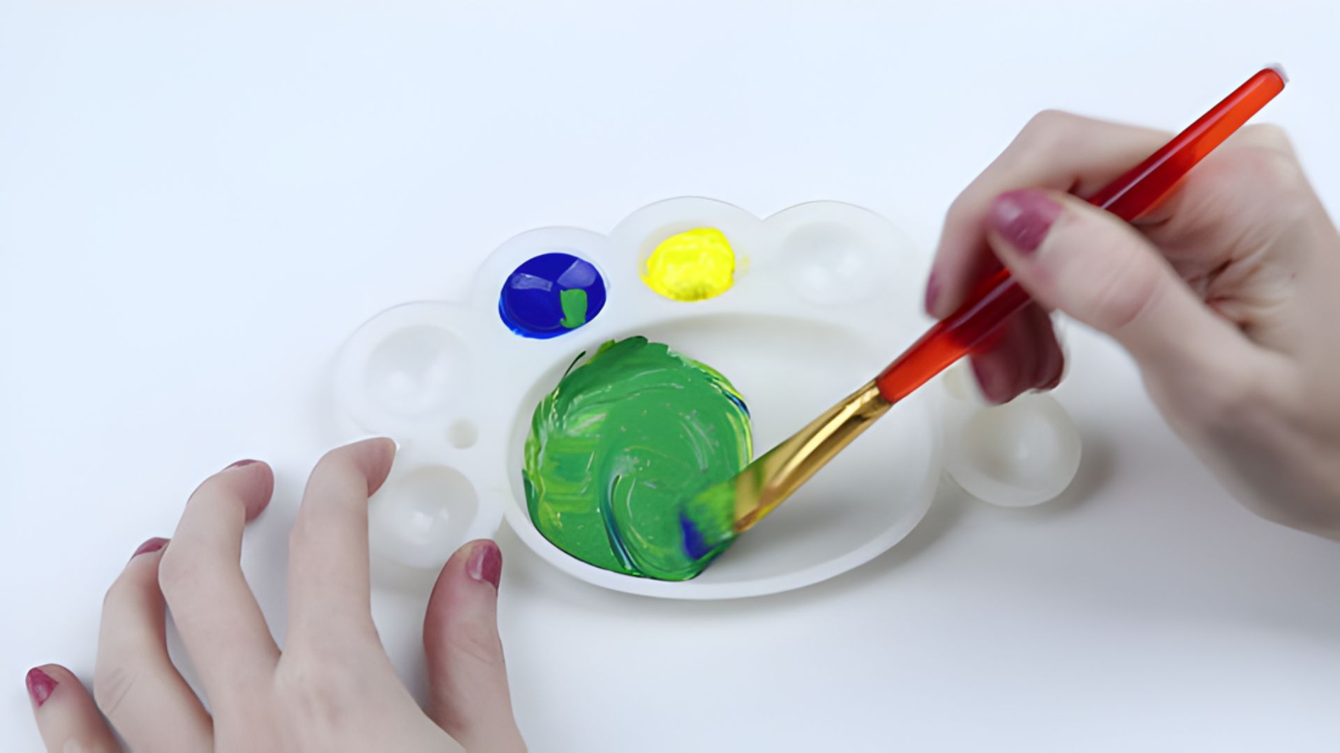
The first time I mixed a truly perfect green, I had been painting for three years and still could not figure out why mine always looked wrong.
If you have ever ended up with a flat or muddy shade, you are not alone.
In this guide, I will show you how to make green in 9 different ways, from bright and vibrant to soft and natural.
You will learn which colors to combine, when to use each mix, and how to avoid common mistakes.
I have tested every method myself, so you can trust what is here.
Understanding the Basics of Green
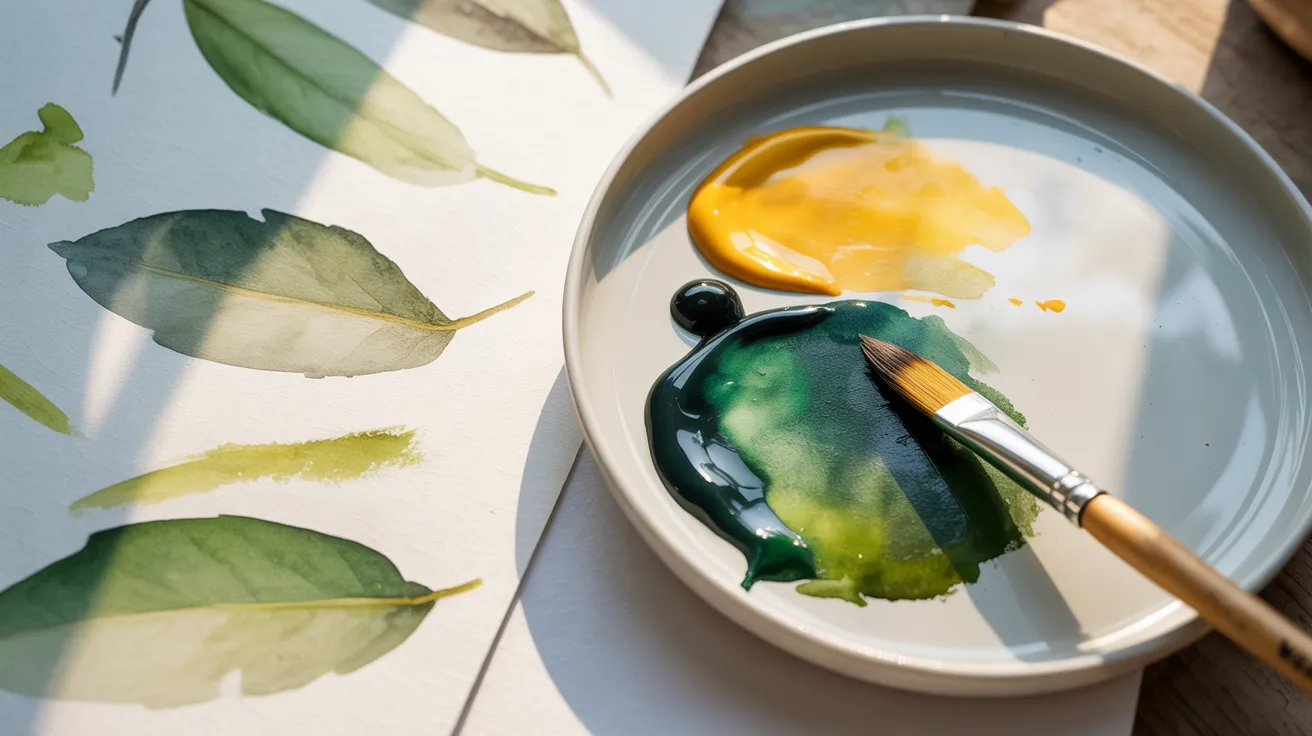
Green sits between yellow and blue on the color wheel. That position tells you everything.
The shade you get depends entirely on which yellow and blue you choose. Warm yellows and blues produce muted, earthy greens.
Cool yellows and blues give you brighter, cleaner results. White lightens any green and softens it into a tint. Black deepens it into something richer and more grounded.
A small touch of red tones down a green that feels too sharp. These are not complicated rules.
They are simple shifts that give you real control over every mix you make before you even pick up your brush.
9 Creative Ways to Mix Green
Here are proven ways to mix green shades for any painting style or subject.
1. Bright Green with Cool Yellow and Cool Blue

Mix lemon yellow with phthalo blue and you get a bright, eye-catching green. This combo works well for spring leaves, fresh grass, and vivid accents.
The cool tones in both colors keep the result clean and sharp. Start with yellow and add blue slowly.
This mix is one of the most reliable ways to get a vivid, punchy green on your palette.
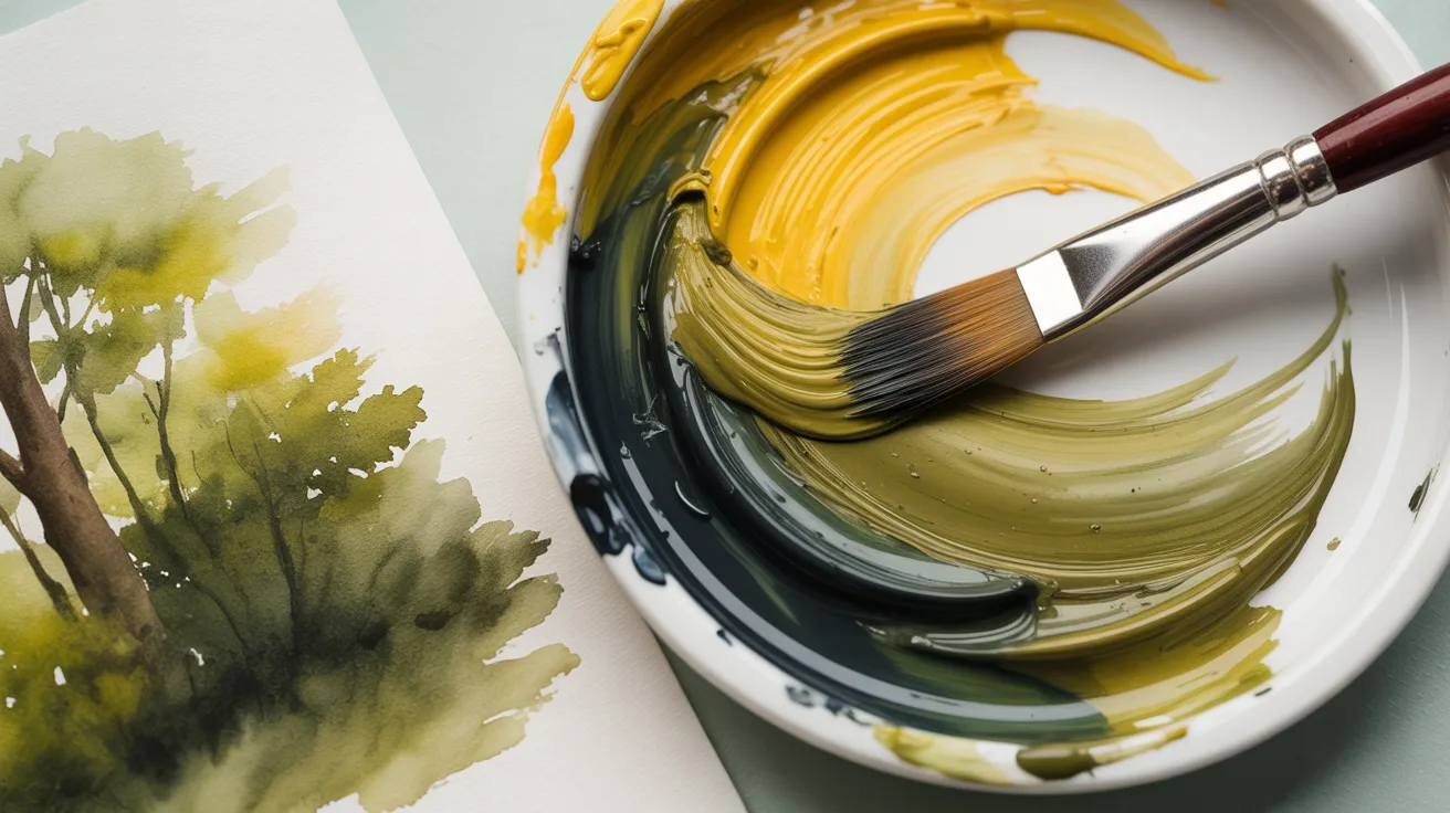
2. Dull Green with Warm Yellow and Warm Blue

Cadmium yellow deep and ultramarine blue together produce earthy, muted greens. These shades work well for natural foliage, shadowed areas, and trees in the distance.
The warmth in both pigments softens the result and gives it a grounded, natural feel. If your painting needs greens that feel aged or worn, this is the mix to reach for.
It is the kind of green that makes a landscape feel honest and real.
3. Easy Green with Ivory Black
Take a cool yellow and add just a touch of ivory black. Mix slowly and add black in small steps.
This gives you deeper, more natural greens without losing the base tone. A simple trick that is well worth knowing.
It is also a great starting point if you do not have blue on hand.
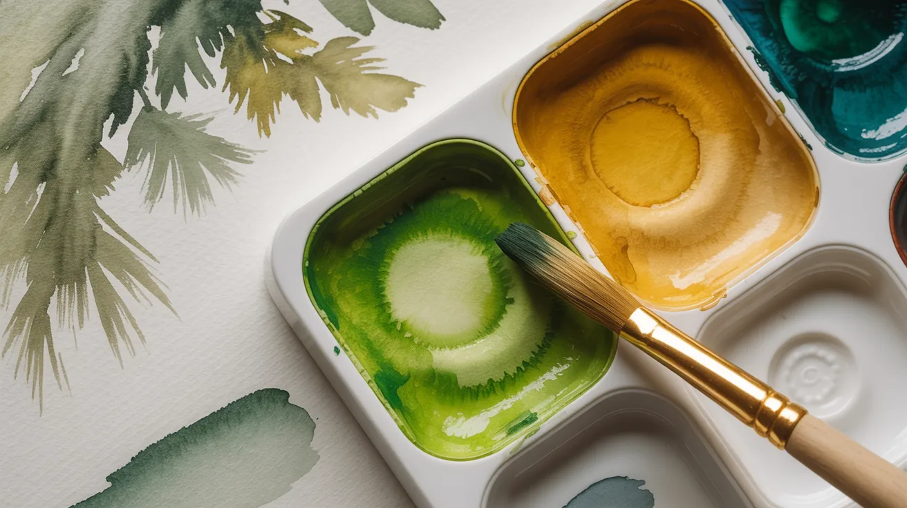
4. Lime Green Tint

Start with any green and mix in white gradually. The more white you add, the softer and lighter the shade gets.
This works well for highlights, young leaves, and fruit tones. Go slow so you do not lose the green base too quickly.
This tint also pairs well with deeper greens when you want contrast across a single leaf or stem.
5. Olive Green
Skip the blue and mix yellow directly with black instead. This gives you a muted, warm olive tone.
It works well for forest scenes, earthy shadows, and camouflage effects. Add more yellow for a lighter olive or more black for a deeper one.
This shade also sits naturally beside browns and ochres in earthy landscape paintings.
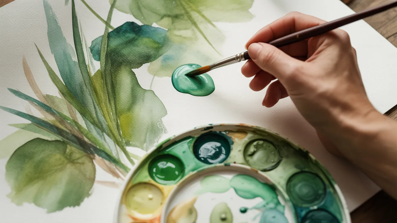
6. Soft Natural Green with Viridian and Yellow Ochre
Mix viridian with yellow ochre and a small amount of white. The result is a soft, realistic green that does not demand attention.
This combination works well for backgrounds and natural foliage where you need subtlety over brightness.
It is especially useful when you want your greens to feel quiet and settled rather than bold.
7. Adjusted Green with Complementary Colors
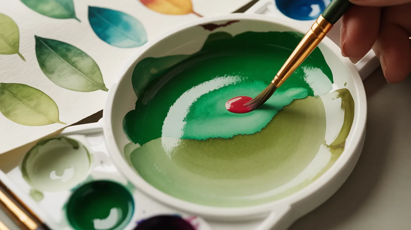
Add a very small amount of red to any green that feels too bright. Red is the complementary color of green, so it tones down the chroma without muddying the mix.
Use it sparingly. A little goes a very long way here. This method works with any green on your palette and gives you far more control over the final result.
8. Layered Green Mixing
Build your greens in layers instead of mixing one flat color. Combine two or more green mixtures and apply them on top of each other.
This creates depth and variation across grass, leaves, and landscapes. It makes your painting feel more alive and real.
The more layers you add, the richer and more complex the surface becomes.
9. Observing Nature for Custom Greens
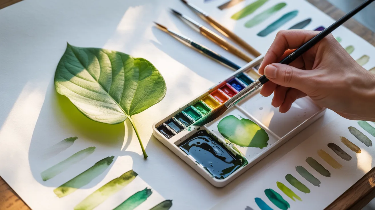
Pick up a leaf, a piece of fruit, or any plant near you and study its color closely. Then try to match it on your palette.
This hands-on practice trains your eye and helps you reproduce realistic greens with more accuracy over time.
The more time you spend looking at real greens, the more confident your mixing will become.
Tips for Perfect Green Mixing
Small habits make a big difference when mixing green.
- Layer gradually. Add color in steps for more control and depth.
- Record your mixes. Note ratios or make swatches for future reference.
- Study real plants. Matching nature trains your eye faster than anything else.
- Add red to fix bright greens. A tiny touch tones down harsh or artificial shades.
- Test on scrap first. Never experiment directly on your final painting.
These small steps save you time and make every mix more intentional.
Conclusion
Green used to frustrate me more than any other color. Every mix looked off and I could not figure out why.
Once I understood the basics of warm and cool pigments, everything clicked. I want that same moment for you.
Start with one mix this week and build from there. You do not need to master all nine at once. Tell me in the comments which method you are trying first.
If this guide made color mixing feel less confusing, pass it along to a fellow artist. They will thank you for it.
Frequently Asked Questions
What is the easiest way to make green paint?
Mix lemon yellow with phthalo blue. Start with yellow and add blue slowly until you get the shade you want.
Why does my green look muddy?
You are likely mixing warm and cool pigments together. Check your yellow and blue tones before you start.
Can I make green without blue?
Yes. Mix yellow with ivory black for a natural, muted green tone.
How do I make a darker green?
Add a small amount of black or a deeper blue. Test on a scrap surface before applying it to your painting.
What colors do I mix to get olive green?
Mix yellow with black instead of blue. More yellow gives a lighter shade, more black gives a deeper tone.