

I still remember the first time I brought a creative onomatopoeia pop art project into my classroom.
The energy shifted instantly. Kids who rarely spoke were suddenly shouting out “CRASH,” “ZAP,” and “BOOM” with big grins on their faces.
This blog covers everything you need to run these projects from start to finish. I will walk you through materials, project ideas, step-by-step instructions, and tips to avoid common mistakes.
You will get clear, practical guidance that works in a real classroom. No fluff. No guesswork.
I have tested these with students across different grade levels.Trust me, the results are always worth the effort.
General Project Overview
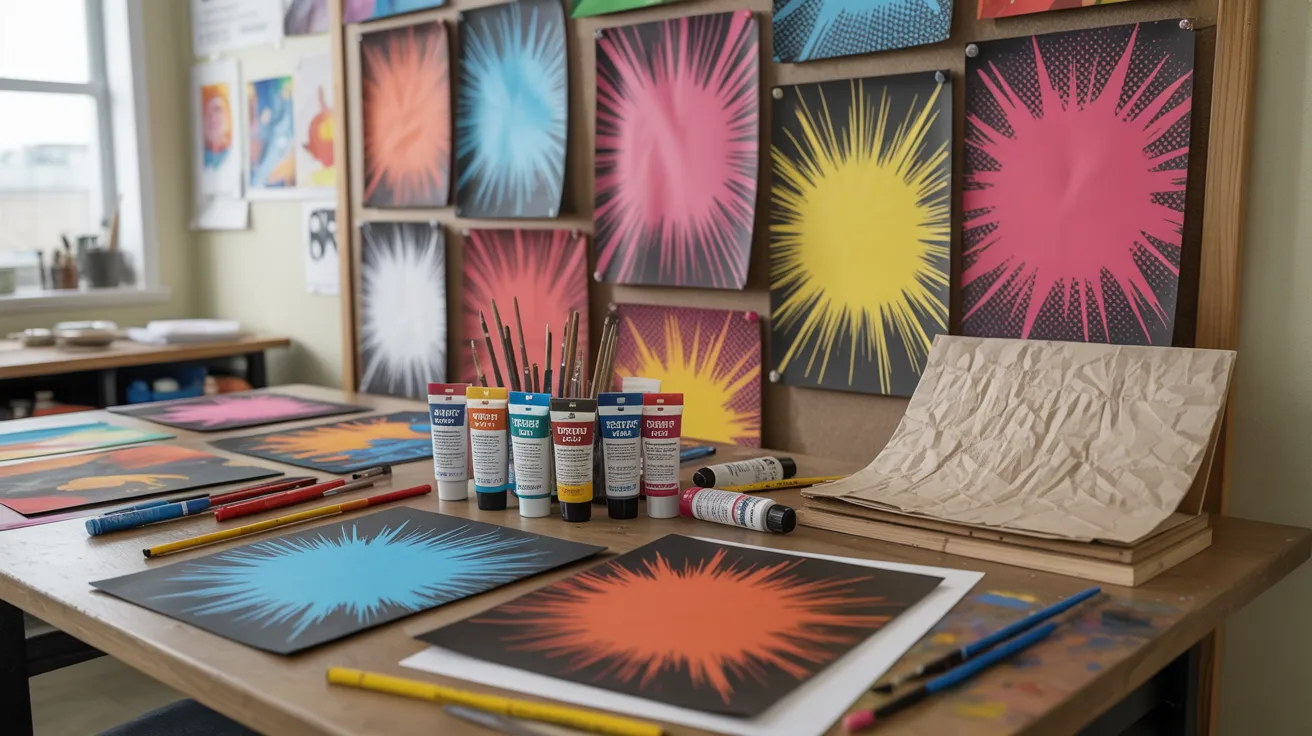
Onomatopoeia pop art uses bold, expressive words as the visual centerpiece of an artwork. Think comic book-style “POW” and “SPLAT” painted in bright colors with eye-catching backgrounds.
These projects teach students about sound words, typography, design, and color theory all at once. They work well for grades 3 through 8. Even reluctant learners get hooked fast.
The results look great on classroom walls and school hallways.
The best part? You do not need to be an art teacher to pull this off. Any classroom teacher can do this with a bit of prep.
Materials Needed
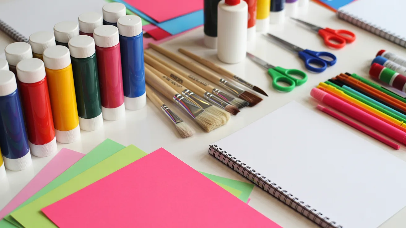
Gather these before you start:
- White cardstock or thick drawing paper (at least 110 lb)
- Pencils and erasers
- Black permanent markers (thick and thin tips)
- Acrylic or tempera paints in bold colors
- Paintbrushes in multiple sizes
- Bubble wrap (for the texture technique)
- Magazines and newspapers for the collage option
- Scissors and glue sticks
- Colored markers or gel pens
- Optional: tablets or computers for the digital version
Project Ideas
Six solid ideas to pick from depending on your class needs.
1. Classic Comic-Style Word Art
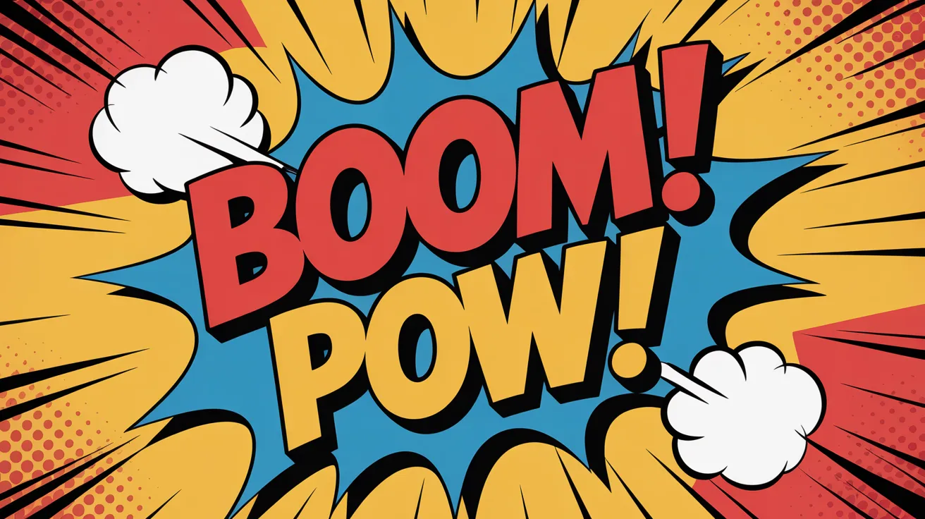
Students pick a sound word and letter it in thick, bold comic book style. They outline each letter with black marker, then fill with solid bright colors.
Simple but striking. Great for beginners and younger students who are new to pop art projects.
2. 3D Layered Pop Art Words

Students create the illusion of depth by stacking layers of color behind each letter. Each letter gets a shadow color added to one side.
This one teaches perspective without making it feel like a lesson. Works great for upper elementary and middle school students.
3. Mixed Media Collage Design
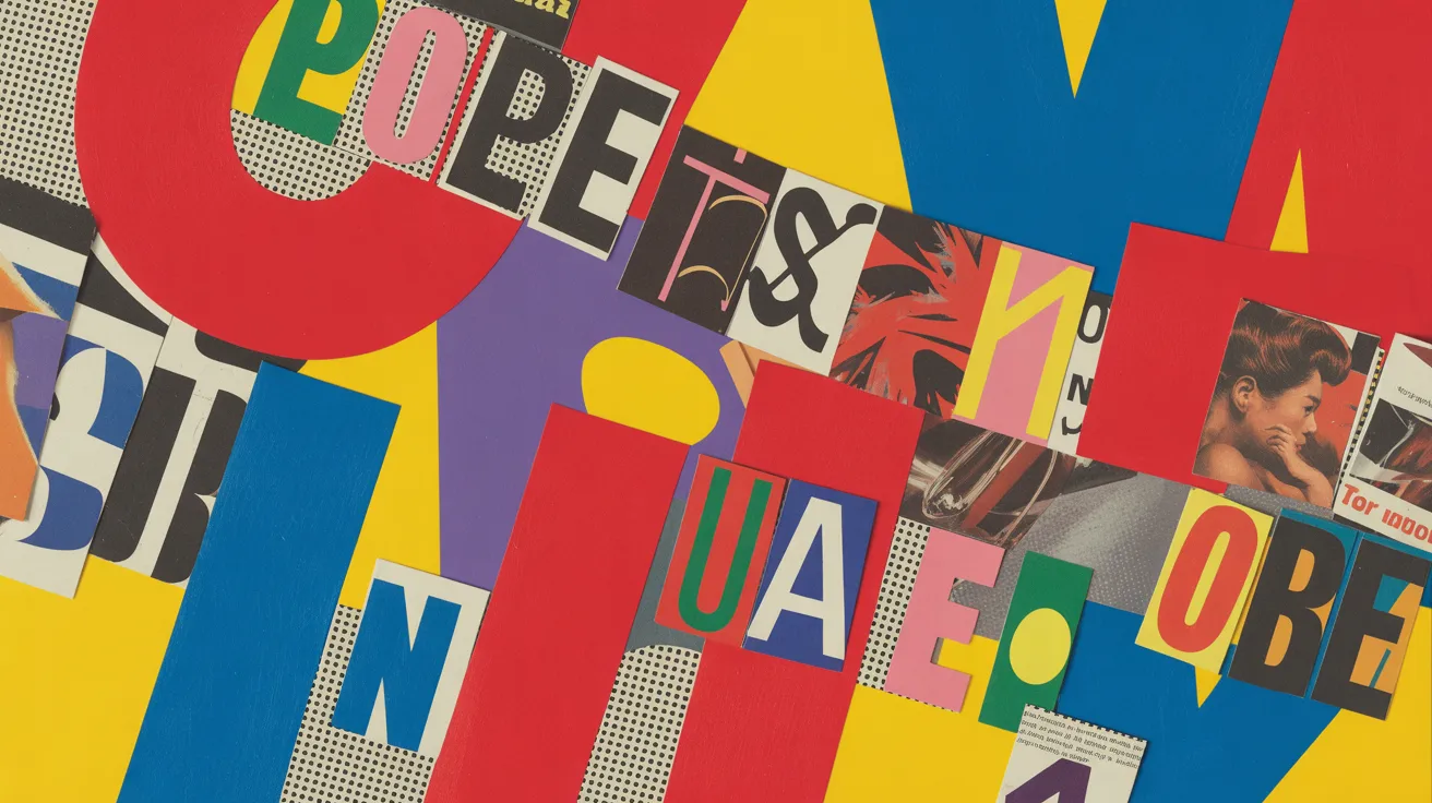
Students cut out letters from magazines or newspapers and arrange them on cardstock. They add painted backgrounds and drawn accents around the letters.
Every piece looks totally different. Good for tactile learners who enjoy cutting and gluing as part of the creative process.
4. Bubble Wrap Dot Background Technique
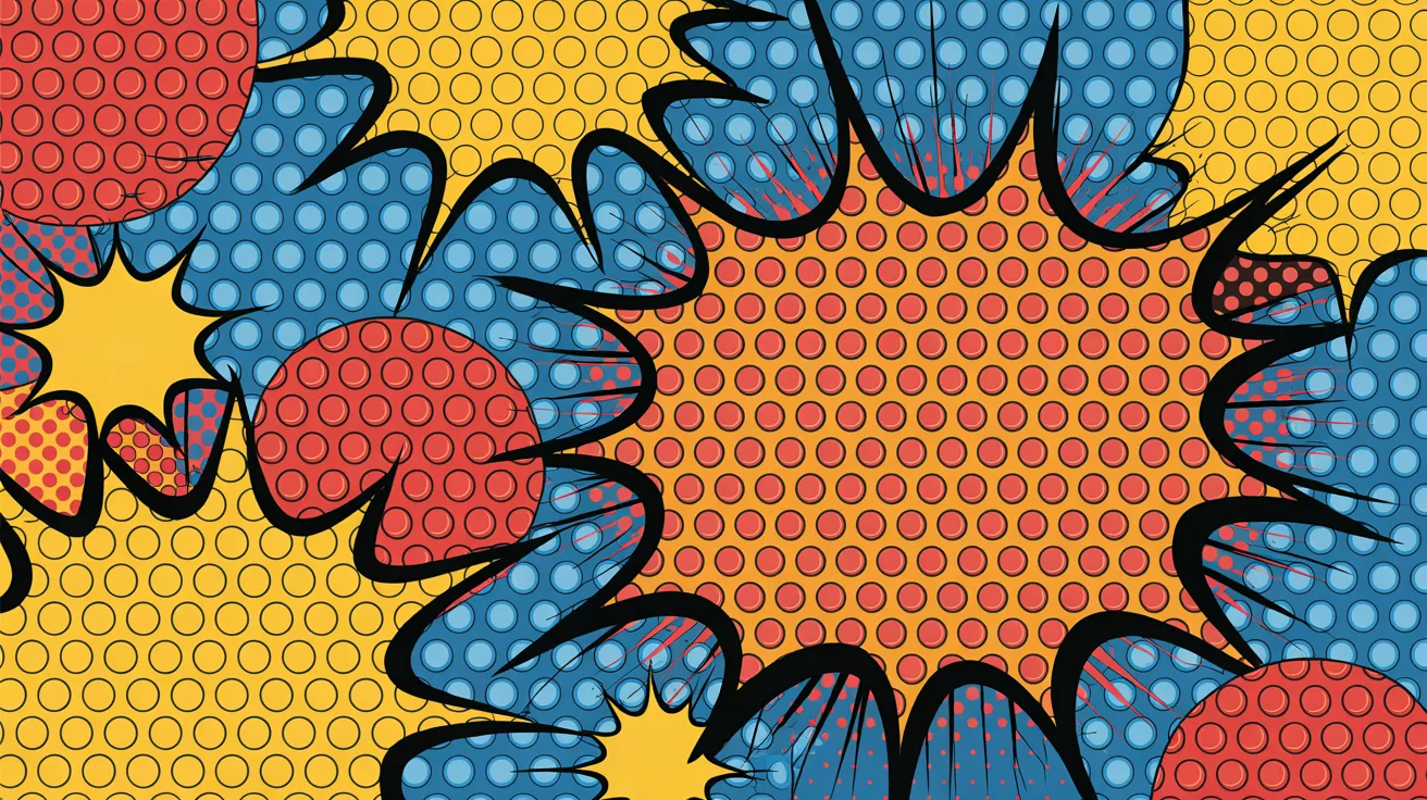
Students dip bubble wrap in paint and press it onto paper to make a polka-dot background. Then they layer their onomatopoeia word on top.
Kids absolutely love the bubble wrap part. Low-mess. High impact. Works with any age group.
5. Digital Onomatopoeia Pop Art
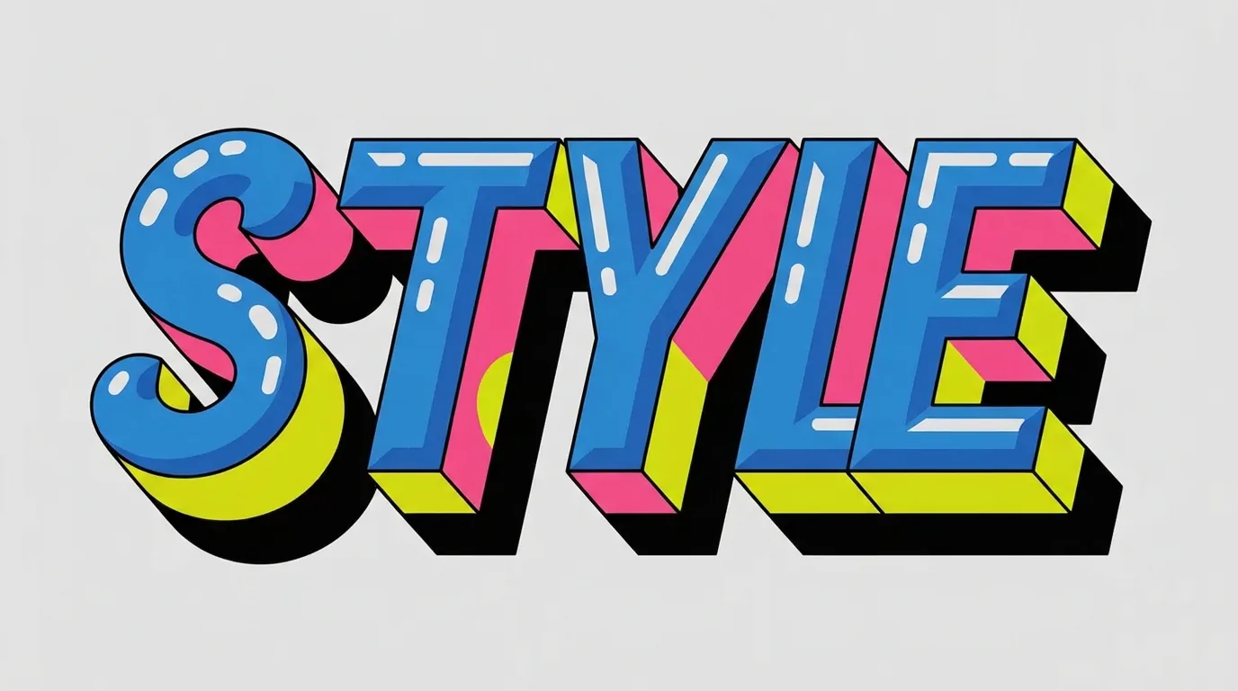
Students use free tools like Canva or Google Slides to design their word art digitally. They choose fonts, colors, and layouts on screen.
Perfect for tech-integrated classrooms or days when paint is too much to manage. The results can be printed or displayed on a screen.
6. Group Collaboration Project
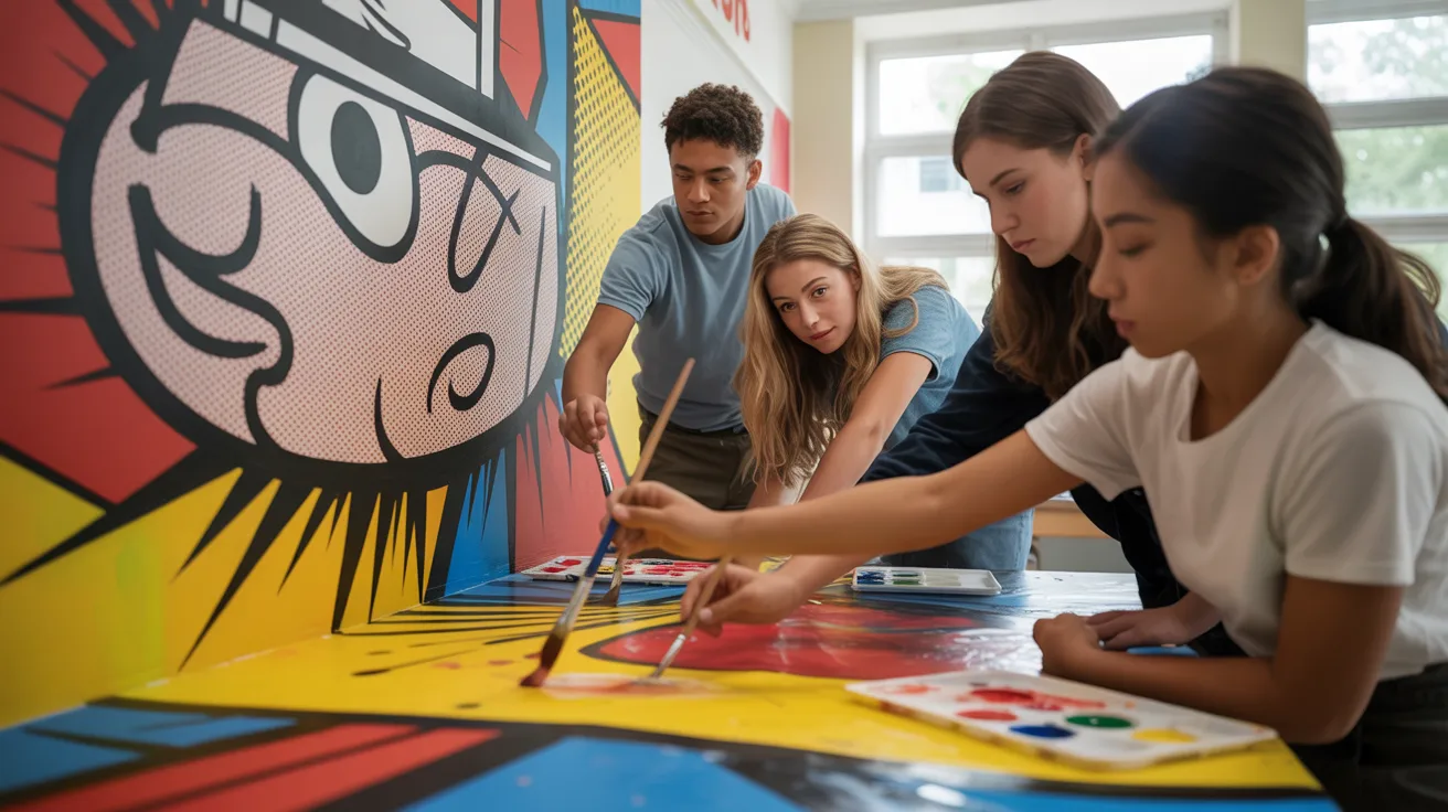
Each student creates one letter or one word. The class then assembles them into one giant piece for a hallway display.
This builds teamwork and gives every student ownership over the final product. One of my personal favorites is to run with bigger classes.
7. Seasonal-Themed Variations

Students pick words that fit a season or holiday. Think “CRUNCH” for fall or “SPLAT” for April showers.
Seasonal themes give students direction without limiting their creativity. You can run this version all year long by just swapping the theme.
Step-by-Step Implementation
Follow these steps for a smooth project from start to finish.
Step 1: Brainstorm Word Selection

Give students a list of onomatopoeia words as a starting point. Words like BOOM, CRASH, HISS, POP, BUZZ, and SNAP work well.
Let them pick their favorite or come up with their own. The word choice matters because students will be working with it for the whole project.
Give them time to choose wisely.
Step 2: Sketch Lettering and Composition
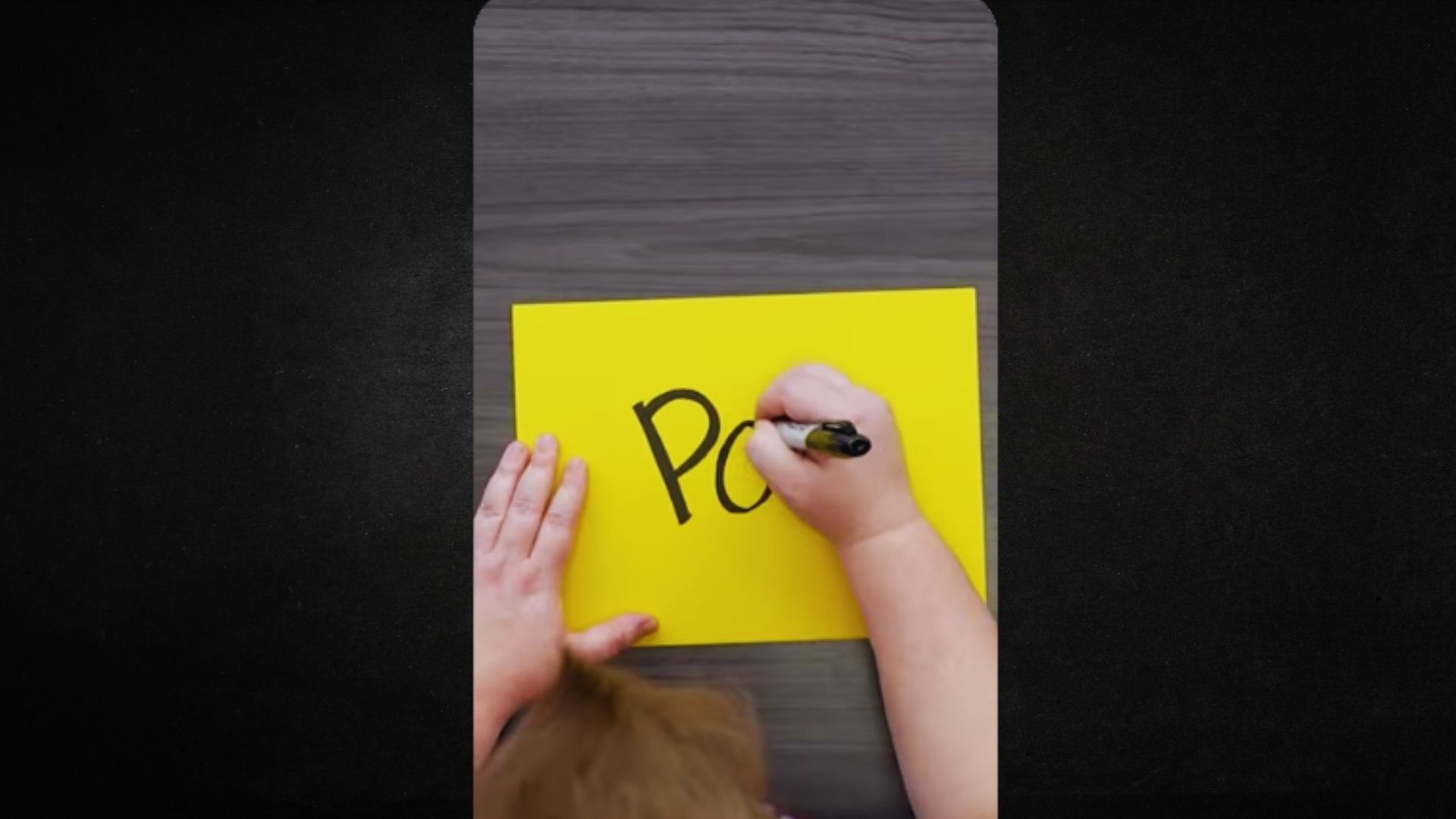
Students lightly sketch their words in pencil first. They should fill most of the page. Letters can be tall, wide, overlapping, or angled.
No two compositions need to look the same. Encourage them to sketch at least two versions before they commit to one layout.
This step saves a lot of frustration later.
Step 3: Design Background Elements
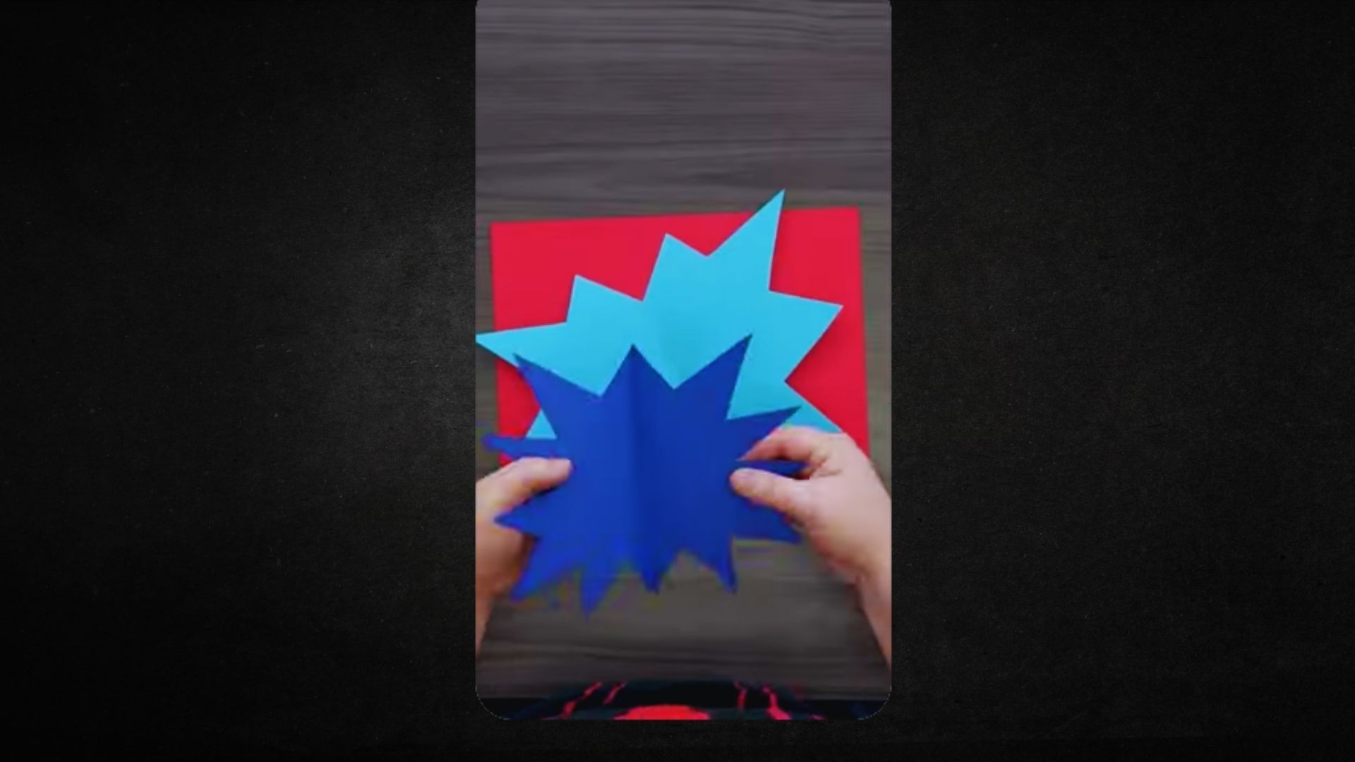
Before adding color to the letters, students plan their background. It can be solid, gradient, patterned, or bubble wrap printed.
The background should contrast with the letters so the word pops off the page. Spend a few minutes on this planning step before any paint goes on paper.
Step 4: Apply Color and Texture
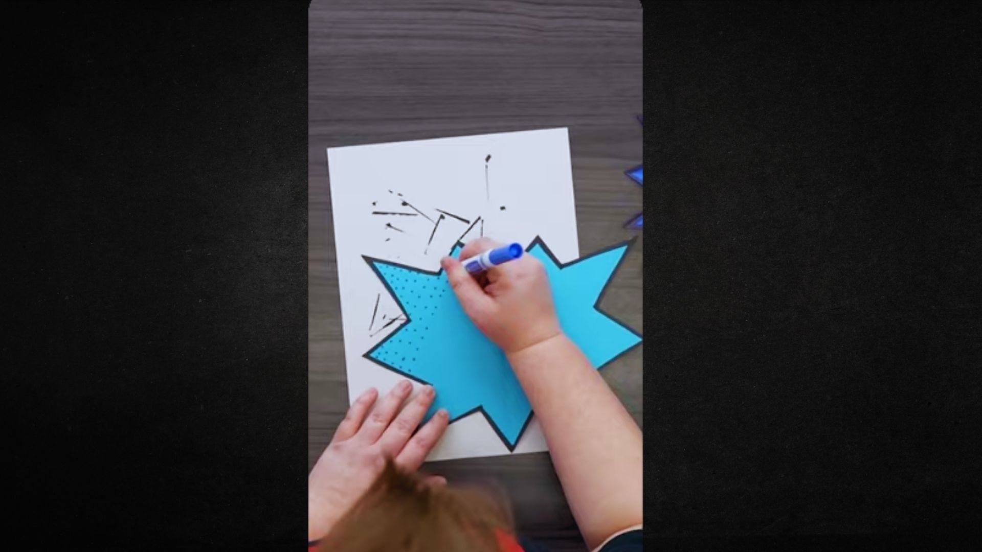
Students paint or color their backgrounds first, then fill in the letters. They add texture details like dots, lines, or cross-hatching inside the letters.
Outline everything with black marker at the very end to make the letters bold and well-defined. Wait for paint to dry fully before outlining.
Step 5: Final Assembly and Presentation
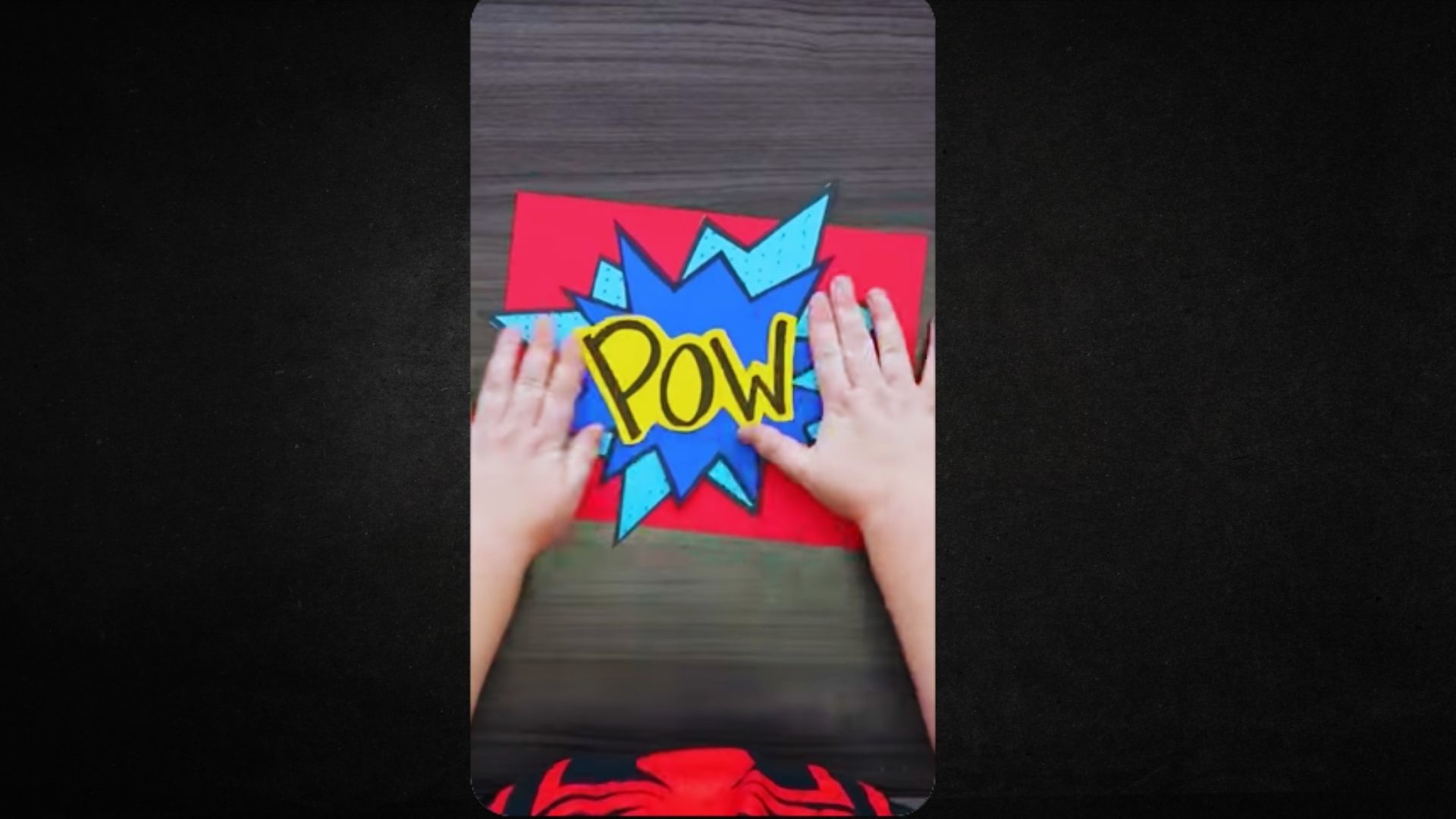
Students write their word, its definition, and a sentence using it on the back of the artwork. Mount finished pieces on colored construction paper.
Display them in a gallery walk format so students can view each other’s work and share feedback. This step makes the project feel complete and meaningful.
Tips and Common Mistakes
Keep these in mind to avoid the usual classroom snags.
- Start with a pencil, always. Skip the sketch step and you will regret it. Make pencil planning non-negotiable before any paint or marker touches the paper.
- Big letters, big impact. The most common mistake is making the word too small. Letters should be at least 3 to 4 inches tall to fill the page.
- Choose contrasting colors. Yellow on white does not work. Stick to a simple rule: light word on dark background, or dark word on light background.
- Let layers dry before outlining. Rushing this step leads to smudged lines. Build in drying time between each step.
- Keep a word bank visible. Some students freeze during brainstorming. A list on the board removes that block fast.
Conclusion
I have seen creative onomatopoeia pop art completely change how kids feel about art class. A simple sound word turns into something they are genuinely proud of.
My personal favorite is the group collaboration. Watching students step back and see the full piece come together is a moment I never get tired of.
Try one of these projects with your class. Then come back and drop a comment telling me how it went. Share this with a fellow teacher who needs a fresh classroom idea.
Frequently Asked Questions
What grade level works best for onomatopoeia pop art projects?
Grades 3 through 8 work well. Younger students do better with classic comic-style, while older students can handle 3D layering and mixed media.
How long does a typical onomatopoeia pop art project take?
Two to three class periods of 45 to 60 minutes each. Spreading it over three days gives drying time between steps.
Can I do this with only markers?
Yes. Bold-colored markers and cardstock are all you need for the classic comic-style version.
What words should I suggest to students who are stuck?
Post a word bank on the board. Good starters: BOOM, CRASH, ZAP, HISS, SPLASH, THUD, and BUZZ. Comic books work great for extra ideas too.
How do I grade this without it feeling subjective?
Use a simple rubric: word legibility, color contrast, full page use, and completion of all steps. Students know what is expected before they start.
