

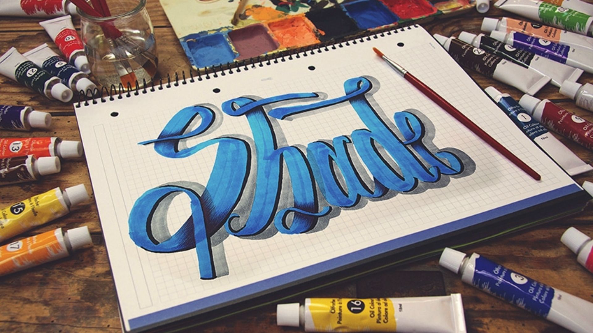
Shadow letters are letters with a shaded area added beside or behind them, making them look like they have depth, almost like they're sitting on top of the page.
The shadow is drawn separately from the letter itself. You're not changing the letter. You're just adding a dark shape next to it.
Shadow lettering works with block letters, brush pen styles, and even simple pencil writing. It doesn't require fancy skills.
Just a basic understanding of how light and shadow interact and a little practice.
Before You Start: Essential Shadow Lettering Basics
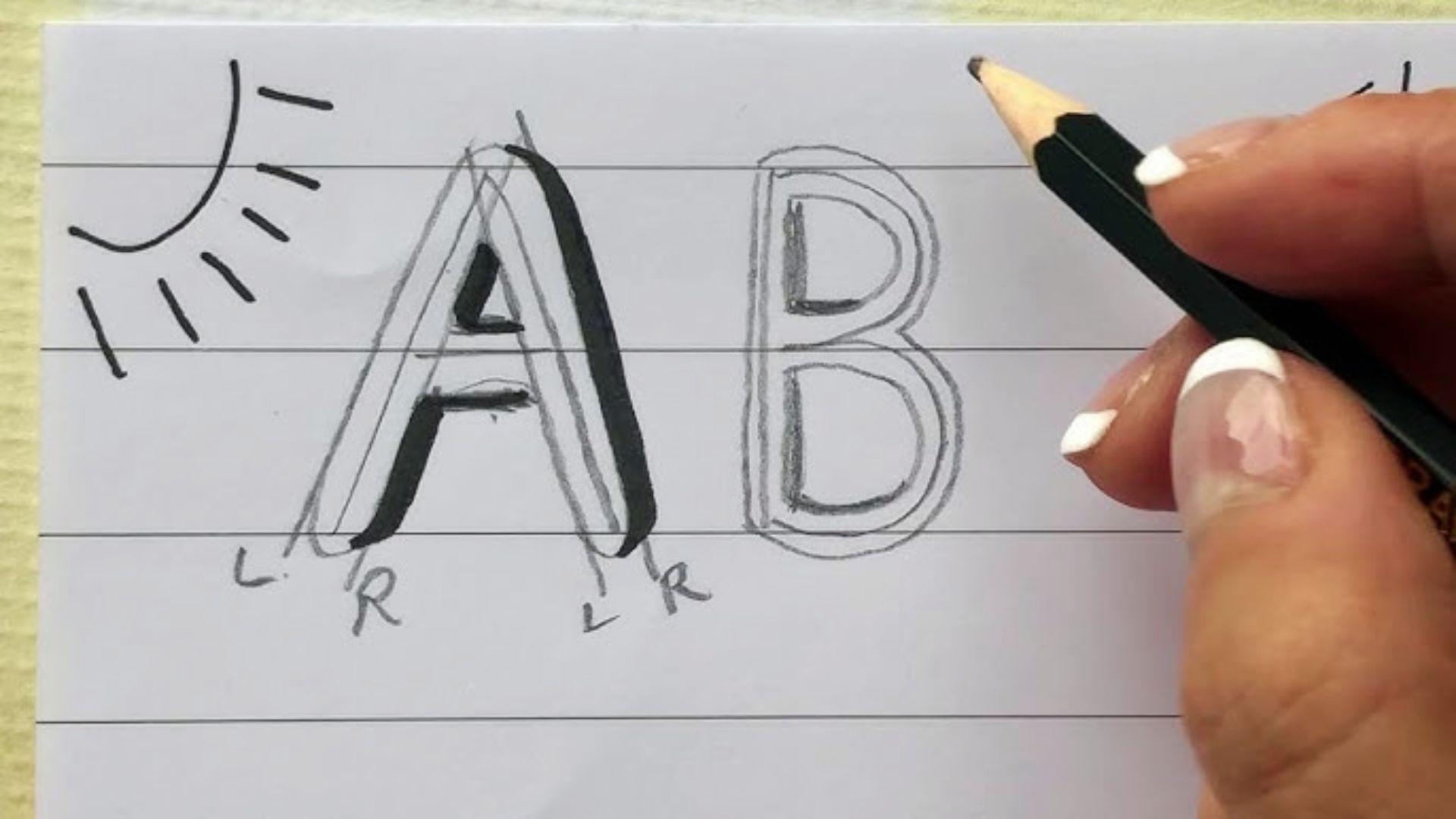
Before touching your pen to paper, a few things need to be decided. Skipping this part is where most beginners go wrong.
These are not complicated rules. They are simple habits that keep your shadows looking clean and consistent.
Decide your light source first, stick to one shadow direction, leave enough spacing between letters, start with block letters before trying script styles, and use simple tools like pencils, grey markers, or brush pens.
Get these basics right and everything else becomes much easier.
Step-by-Step Guide to Easy Shadow Letters
Follow these five steps to add clean, confident shadows to any lettering style.
Step 1: Draw Your Base Lettering

Start by writing your letters clearly and neatly.
Use a pencil first so you can make corrections easily. Keep the letters at a size that gives you enough room to add shadows around them.
Do not rush this step. Your shadows are only as good as your base letters. If the base is shaky or uneven, the shadows will make that more obvious, not less.
Leave extra space between each letter. This room is where your shadows will live.
Step 2: Choose and Visualize your Light Source
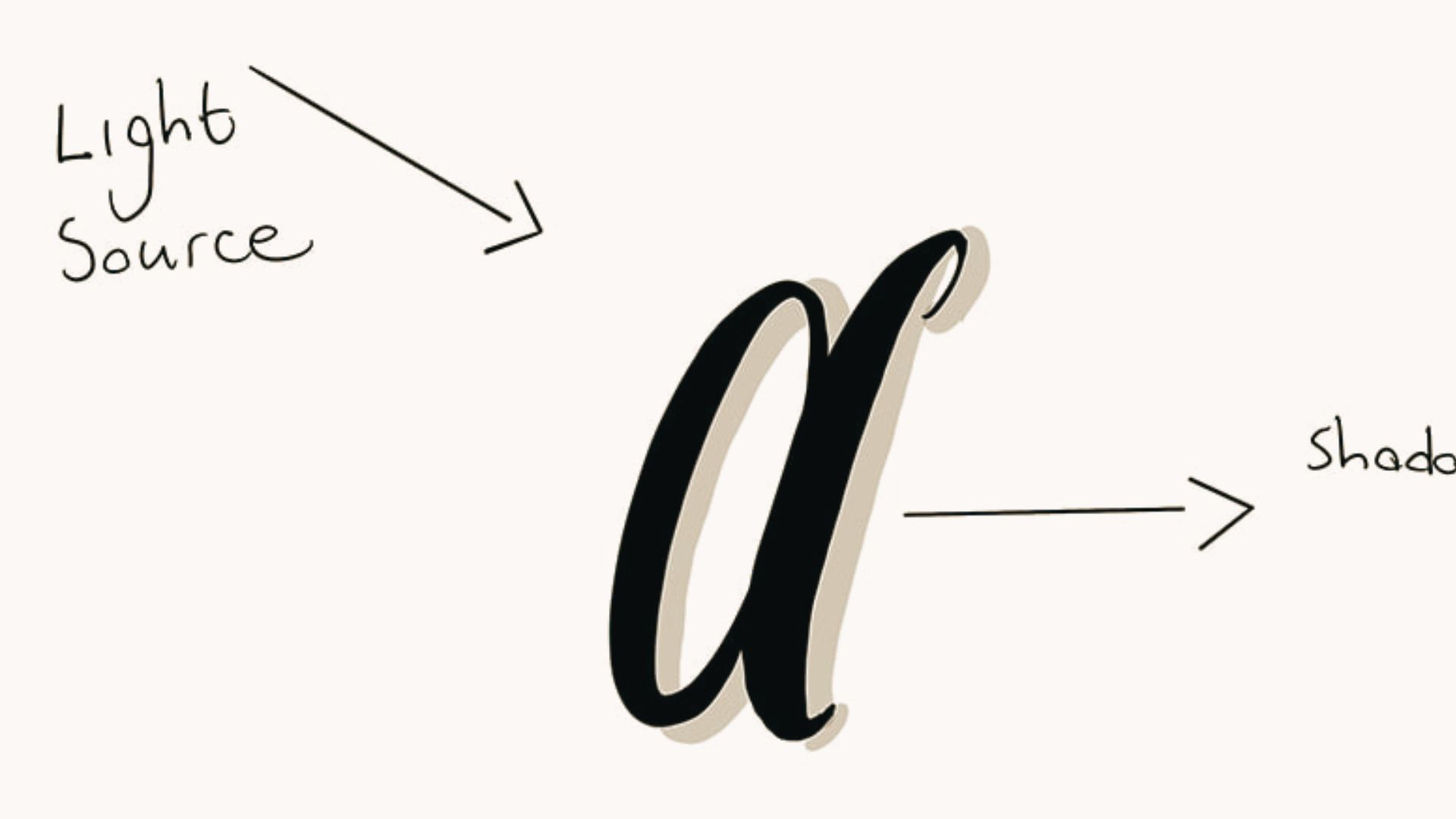
Before drawing any shadow, decide where your light is coming from.
Look at your letters and mentally place a light above them, to the left, to the right, or at an angle.
Then ask yourself:where would the shadow fall?
You can draw a small arrow or sun symbol at the top of your paper to remind yourself of the direction. This small habit prevents a lot of mistakes later.
Step 3: Add Shadows on the Opposite Side

Now draw the shadow on the side opposite your light source.
For block letters, this means drawing a copy of the letter's edge slightly offset in the shadow direction. Then fill in the space between the original edge and the offset line.
Start light. Use a pencil or light grey pen. You can always go darker. You cannot easily go lighter once the ink is down.
Work letter by letter. Do not rush across the whole word at once.
Step 4: Match Shadow Thickness to Letter Strokes
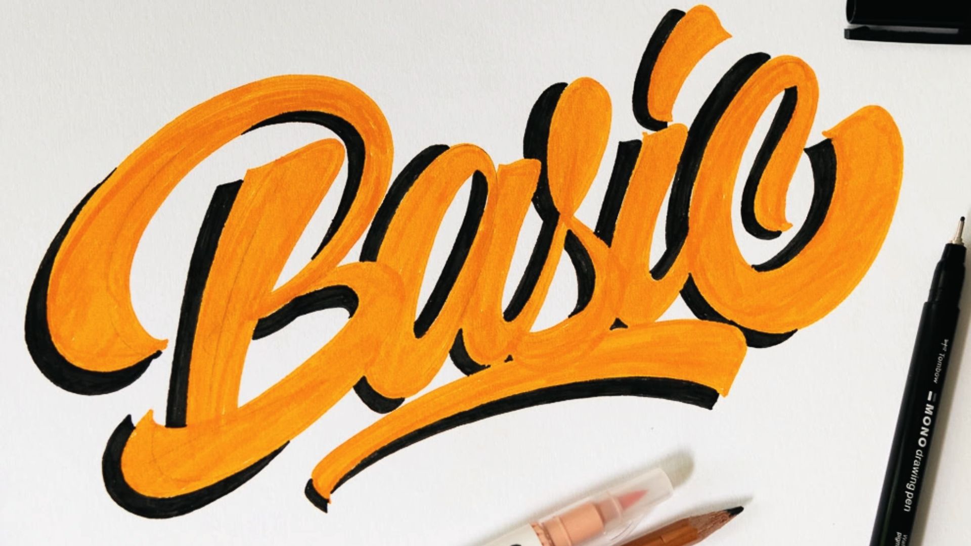
Your shadow thickness should feel proportional to the letter.
Thin letters get thin shadows. Thick block letters can handle a thicker shadow. If the shadow is too thick, it will overpower the letter. If it is too thin, it will barely be visible.
A good starting point is to make the shadow roughly the same thickness as the thinnest stroke in your letter. Then adjust from there based on how it looks.
Step back from your work. Look at it from a small distance. This helps you see if the shadow thickness feels right.
Step 5: Refine Edges for a Smooth 3D Effect

Once all your shadows are placed, go back and clean up the edges.
Use a fine liner to sharpen any blurry lines. Erase any pencil marks that are showing outside the shadow area. Make sure the shadow lines are smooth and connect cleanly at the corners.
This step is what gives your lettering a finished, three-dimensional feel. Even a small amount of cleanup makes a big difference in the final look.
Common Mistakes to Avoid in Shadow Lettering
Avoiding these four mistakes will save you time and keep your lettering looking sharp and intentional.
- Changing your light direction mid-design is the most common mistake. Decide your light source before you start and mark it on the paper so every shadow points the same way.
- Uneven shadow thickness makes your lettering look unbalanced. Pick a thickness before you start and keep it the same across every single letter.
- Too much shading makes letters hard to read. Keep shadows clean and proportional. When in doubt, go lighter as a subtle shadow always looks neater.
- Ignoring letter spacing causes shadows to overlap and crowd each other. Always leave more room between letters than you think you need.
- Rushing through the process leads to sloppy results. Slow down, check each letter before moving to the next, and fix small issues early before they add up.
Beginner Hacks for Perfect Shadow Letters
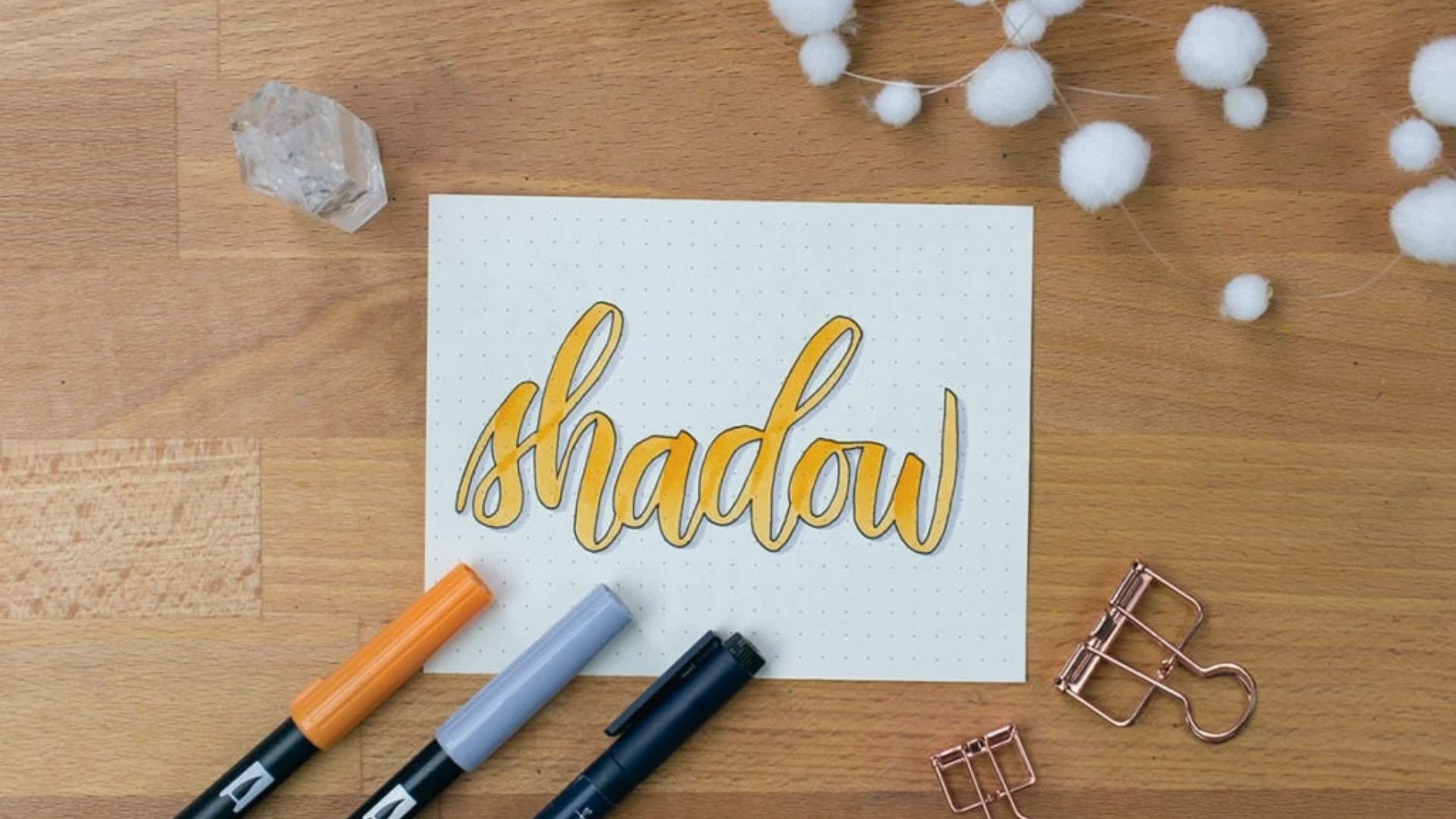
These three practical methods help you place shadows accurately without second-guessing yourself.
Tracing Paper Method for Accurate Placement
Place tracing paper over your base letters and trace them. Shift the paper slightly in your shadow direction and trace again.
Transfer this to your final paper for a clean, accurate shadow every time.
Instagram or Digital Layering Trick for Practice
Take a photo of your lettering and open it in an app like Snapseed. Add a shadow digitally to see how it looks before putting pen to paper. Once you are happy, recreate it by hand.
Pencil Sketch First, Ink Later Technique
Always sketch your letters and shadows in pencil before using ink. Once everything looks right, go over it with a fine liner. Let it dry fully, then erase the pencil marks.
Easy Tips for Clean Shadow Letters
These five habits will keep your shadow lettering looking neat, consistent, and well-balanced from the start.
- Always decide your light source before you start. Top-left works best for beginners. Pick one direction and stick with it throughout the whole design.
- Keep every shadow in the same spot across all letters. Same direction, same distance, same thickness. Check each letter before moving to the next.
- Leave enough space between your letters. Shadows need room to sit cleanly. If letters are too close, the shadows will overlap and look cluttered.
- Start with block letters before trying script styles. They are simpler to shadow and help you build confidence before moving to harder styles.
- Use a light grey marker or pencil instead of black ink. It is easier to control, and you can always go darker once you are happy with the placement.
Conclusion
Easy shadow letters are not as hard as they look. You just need a light source, consistent shadows, and a little patience.
When I first started, my shadows were uneven and all over the place. But the more I practiced, the more natural it felt. Start with one word today.
Pick a simple block letter style and add a shadow. See how it looks. Then try another style. Keep going.
Share your work in the comments below. I'd love to see what you make and hear how it goes.
Frequently Asked Questions
What is the easiest shadow style for beginners?
The monoline shadow is the simplest to start with. You just draw a single offset line beside each letter stroke without any filling or blending.
Do I need special pens for shadow lettering?
No special pens are needed. A regular pencil, grey marker, or fine liner works perfectly well for adding clean shadows to your letters.
How do I stop my shadows from looking uneven?
Pick a fixed shadow direction before you start and keep the thickness the same across every letter. Checking each letter one at a time helps a lot.
Can I add shadows to cursive or script lettering?
Yes, but it is trickier than block letters. Get comfortable with simple printed letters first before moving on to connected script styles.
How far should the shadow be from the letter?
A small offset works best for clean results. Start with a gap roughly equal to the width of your thinnest pen stroke and adjust based on how it looks.
