

I used to mix paint as a kid and always ended up with something muddy. It was frustrating.
If you have ever wondered what are the primary colors of pigment and why they matter, you are in the right place.
This blog breaks down the pigment primary colors, how they mix, how they compare to light, and where all of this shows up in real life.
I will also clear up the confusion between CMY and the classic red, yellow, and blue you learned in school.
I have worked with color theory across design and art, and I will keep this practical and clear for you.
What Are the Primary Colors of Pigment?

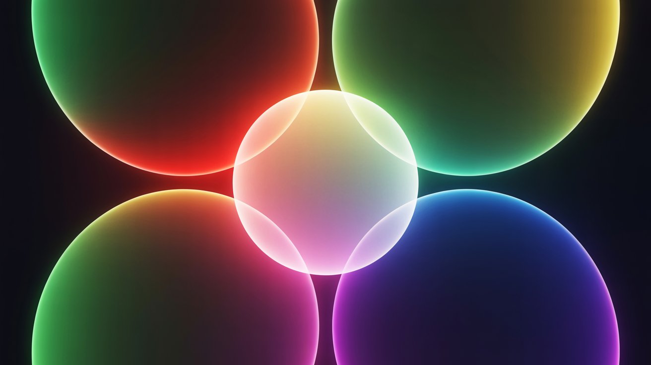
So, what are the primary colors of pigment? The most precise answer is cyan, magenta, and yellow. These are called the CMY model.
In color science and professional printing, CMY is the standard. They are treated as base colors because they cannot be accurately reproduced by mixing other pigments together.
Most colors can be created by combining these three, though some shades are difficult to reproduce perfectly with real pigments.
That is exactly why artists and printers still keep extra specialty colors on hand.
But here is where it gets more layered. Most of us grew up learning red, yellow, and blue as the primaries. That system is called RYB.
It is not wrong. It is a practical system used in traditional painting for centuries. Artists still rely on it today.
The difference is context.
CMY is more accurate for printing and color science. RYB is the go-to system for painters and artists. Both are valid depending on what you are doing.
What Are the Primary Colors of Pigment vs. Primary Colors of Light?

The pigment color primaries and light primaries look similar on the surface but work completely differently.
The primary colors of light are red, green, and blue. That is the RGB model. Your phone screen, TV, and monitor all use RGB.
The primary pigment colors are cyan, magenta, and yellow. Paint, ink, and dyes use this system.
These two models work in opposite ways.
Light is additive. You start with darkness and add light. Mix all three RGB colors and you get white.
Pigment is subtractive. You start with a surface and add pigment. Pigment absorbs light instead of creating it. The color that reflects back is what your eye sees.
Mix all three pigment primaries and most light gets absorbed. The result is dark, not bright. That single difference is the reason most color mixing confusion happens.
How Pigment Mixing Works (Subtractive Color Model)
In the subtractive model, each pigment you add absorbs more light. The more you layer, the less light reflects back, and the darker things get.
With ideal pigments in theory, CMY mixing works like this:
Cyan + Magenta = Blue Cyan + Yellow = Green Magenta + Yellow = Red Cyan + Magenta + Yellow = Near-black (in theory, a muddy dark in practice)
That last point matters a lot. In theory, all three together should produce black.
In practice with real inks and paints, you get a dark brownish tone, not a true black. Impurities and slight color biases in real pigments get in the way.
Also worth noting: real paint mixing often drifts from the ideal. A mix of cyan and magenta paint may lean purple rather than a clean blue, depending on the specific pigments used.
Pigment temperature and quality both affect your results more than most people expect.
How Light Mixing Works (Additive Color Model)
In the additive model, you start with darkness and add colored light. More light means a brighter result.
With ideal light sources, RGB mixing works like this:
Red + Green = Yellow Red + Blue = Magenta Green + Blue = Cyan Red + Green + Blue = White
This is how your phone screen works right now. Every pixel mixes tiny amounts of red, green, and blue light to produce what you see.
Pigment builds down toward dark. Light builds up toward bright. That one difference makes the two systems feel like opposites, because they are.
CMY vs. CMYK: Why Black Is Added
If you have ever used a printer, you have seen CMYK. The K stands for black.
In theory, mixing cyan, magenta, and yellow should produce black. In practice, it produces a dark brownish-gray. Real inks are not perfectly pure, and layering all three wastes a lot of ink.
So the print industry adds a dedicated black ink for three reasons:
- True, sharp black for text and fine lines
- Cleaner, richer dark tones in images
- Lower ink costs across large print runs
A single black cartridge handles all of that far better than three imperfect inks layered together. That is why every inkjet and laser printer has four cartridges: cyan, magenta, yellow, and black.
CMYK is the global standard for all printed materials.
Practical Examples of Pigment Mixing
Here are some everyday mixing examples worth knowing.
With ideal pigments, cyan and yellow give you green. Magenta and yellow give you a warm red. Cyan and magenta give you a blue-violet.
But real paint shifts things. If your cyan leans warm, the green you mix will look murkier. If your magenta pulls toward red, the violet will drift.
Even small pigment biases change the outcome noticeably.
Ratios matter just as much. A tiny extra amount of one color shifts the result. I always test on scrap paper before committing.
When you add a third color to any mix, things darken fast. Two primaries together stay fairly bright. Three primaries together move toward a neutral dark tone. That is just subtractive color doing its job.
Common Misconceptions About Primary Colors
A few things come up repeatedly.
Red, yellow, and blue are not "wrong" primaries. RYB is a traditional, practical system for painting. CMY is more precise for printing and color science.
Both exist because they serve different purposes.
Pigment and screen color are not interchangeable. Screens use RGB. Pigments use CMY or RYB. Mixing up the two causes problems in design work, especially when printing files created in RGB mode.
You cannot always mix every color cleanly from three primaries. No real pigment is chemically perfect. Ultra-vivid purples, certain bright blues, and neon shades are very hard to reproduce with CMY alone. That is why specialty spot inks and extra tube colors exist.
Black and white are not primary colors in any model. Black absorbs all light. White reflects all of it. Neither functions as a primary.
Real-World Applications of Pigment Primary Colors
Understanding primary pigment colors has direct, practical value across several fields.
In printing, every magazine, packaging, and flyer uses CMYK. Sending a design file in RGB mode to a printer causes color shifts. Working in CMYK from the start prevents that.
In painting, understanding CMY helps you mix cleaner results with less muddiness. Even within the traditional RYB system, knowing why mixes go dull helps you correct them faster.
In textile design, dyes follow the same subtractive rules. Designers use CMY logic to predict how fabric dyes combine.
In photo editing, CMY is used for color correction in both digital and darkroom printing processes.
In graphic design, print projects require CMYK files. Knowing the difference between screen color and print color saves real time and money.
Once I understood these systems properly, color decisions stopped feeling like guesswork.
Conclusion
The primary colors of pigment are cyan, magenta, and yellow in professional color science and printing.
In traditional art, red, yellow, and blue have served painters well for a long time and still do. Neither system is simply wrong. They serve different purposes in different contexts.
CMY is more precise for print and science. RYB is a reliable, practical guide for working with paint on a canvas. Light and pigment work in opposite ways, and keeping that straight clears up most color confusion.
Knowing which system fits your work, and why, makes everything easier. Cleaner mixes, better print results, fewer surprises.
I hope this made color theory feel less complicated and more useful in practice.
What is one color mixing result that has confused or surprised you? Drop it in the comments. I would love to help figure it out.
Frequently Asked Questions
What are the primary colors of pigment used in professional printing?
In professional printing, the primary colors of pigment are cyan, magenta, and yellow. These form the CMY model and serve as the basis for the CMYK system used in all standard printing.
Is red, yellow, and blue still a valid primary color system?
Yes. Red, yellow, and blue form the RYB system widely used in traditional painting. It is a practical approach for artists and is still taught and applied in studio art today.
Why does mixing all three pigment primaries produce a dark muddy color rather than black?
Real pigments carry slight impurities and color biases. When all three are mixed, most light is absorbed, but not cleanly, leaving a brownish-dark tone instead of a true black.
What is the difference between subtractive and additive color mixing?
Subtractive mixing adds pigments to a surface, absorbing light and darkening the result. Additive mixing combines light sources, brightening toward white. Pigments subtract. Screens add.
Why does CMYK printing need a black ink if the primaries already mix dark?
Because mixing cyan, magenta, and yellow with real inks produces an impure dark tone, not a true black. A dedicated black ink gives sharper text, richer shadows, and lower ink costs compared to layering all three primaries.